Points clés
Le logo minimaliste : élégance et intemporalité
Le logo audacieux : différenciation et impact visuel
Quelle option choisir pour votre marque ?
Tendances graphiques et adaptabilité aux supports
Introduction
Le logo, c’est le premier élément que l’on retient d’une marque. Il incarne son identité visuelle, donne le ton et influence directement la perception client. Minimaliste ou audacieux, chaque style a son propre impact sur le branding.
D’un côté, la tendance du graphisme épuré prône une approche simple, intemporelle et adaptable. De l’autre, les designs audacieux jouent la carte de la différenciation et de l’impact visuel.
Alors, quelle direction prendre pour votre marque ?
Le logo minimaliste : élégance et intemporalité
Le minimalisme, en design graphique, repose sur l’idée du “moins, c’est mieux”. Un logo épuré mise sur :
✔ Des formes simples et équilibrées
✔ Une typographie claire et lisible
✔ Un choix de couleurs restreint mais percutant
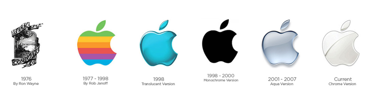
De grandes marques ont adopté cette approche avec succès : Apple, Nike, Chanel… Leur force ? Un logo immédiatement reconnaissable, même en noir et blanc. Cette simplicité inspire la modernité, le luxe et le professionnalisme, tout en s’intégrant parfaitement aux différents supports, notamment en broderie fine.
👉 Un logo minimaliste est idéal si vous recherchez une identité sobre, intemporelle et polyvalente.
Le logo d'apple est très connu, mais au départ c'est un logo plus chargé que celui actuel.
Le logo audacieux : différenciation et impact visuel
À l’opposé du minimalisme, certains logos jouent la carte de l’expérience utilisateur et de l’émotion forte. Ici, on mise sur :
✔ Des couleurs vives qui attirent l'œil
✔ Des typographies marquées, parfois déstructurées
✔ Des éléments graphiques dynamiques et expressifs
Netflix, MTV and even Spotify have chosen strong logos that stand out instantly. These designs generate an immediate visual impact and encourage memorability.
L’approche audacieuse fonctionne aussi en version logo 3D, en jouant sur le volume et les textures pour créer un effet "waouh". Parfait pour le digital et les supports animés, ce type de logo capte l’attention et renforce l’engagement.
👉 Un logo audacieux est idéal pour une marque qui veut se différencier et marquer les esprits.
Quelle option choisir pour votre marque ?
Tout dépend de votre stratégie marketing et de votre positionnement :
✔ Votre secteur : Une banque et une marque de streetwear n’auront pas les mêmes attentes en matière de communication de marque.
✔ Votre audience : Sobre ou percutant, que recherche votre clientèle cible ?
✔ Vos valeurs : Minimalisme = élégance et clarté. Audace = créativité et dynamisme.
Vous pouvez aussi opter pour un compromis malin : un logo minimaliste avec une touche audacieuse, par exemple via une couleur vibrante ou une typographie légèrement décalée.
Tendances graphiques et adaptabilité aux supports
En 2025, les tendances penchent vers une cohérence visuelle forte et une adaptabilité multi-supports. Un logo doit fonctionner aussi bien sur un site web qu’en broderie ou en impression.
✔ Le minimalisme assure une lisibilité parfaite et une reproduction facile sur tous les supports.
✔ L’audace fonctionne particulièrement bien en digital et permet d’exploiter des textures et des animations.
L’important ? Penser à la flexibilité pour garantir une utilisation fluide sur tous vos canaux de communication.
Conclusion
Minimaliste ou audacieux, chaque approche a ses forces. Le choix dépend de votre identité visuelle, de votre audience et de vos valeurs.
À retenir :
✔ Minimalisme = Élégance, intemporalité, adaptabilité.
✔ Audace = Impact fort, différenciation, mémorisation.
Quel que soit votre choix, faites en sorte que votre logo s'inscrive de manière cohérente dans votre stratégie de marque et qu'il soit efficace sur tous vos supports. Vous avez une question concernant votre prochaine commande ? Découvrez comment préparer et envoyer votre logo comme un pro..
Logo minimaliste ou logo audacieux: que choisir pour votre marque ?