Bonjour à tous, ici Leïla de chez Inkoo!
Aujourd’hui je vous parle des impressions textiles sur vêtements foncés et les erreurs qu’il ne faut surtout pas commettre.
L’impression sur textile foncé peut amener un rendu extrêmement qualitatif et contrasté au niveau des couleurs mais il faut tout de même s’en méfier car il peut y avoir des pièges et des spécificités.
Nous allons aborder ensemble les spécificités techniques, ensuite les méthodes recommandées, les erreurs fréquentes et nos conseils pratiques pour éviter celles-ci (entre autres la meilleure technique pour imprimer sur du tissu foncé).
Points clés
- Imprimer sur un t-shirt foncé, ce n’est pas aussi simple qu’il n’y paraît.
- Erreur classique : visuel invisible ou effet "carton" désagréable au toucher.
- L’impression sur textile foncé demande une base blanche pour faire ressortir les couleurs.
- Sans encres opaques et pigmentées, le visuel peut disparaître ou virer de teinte.
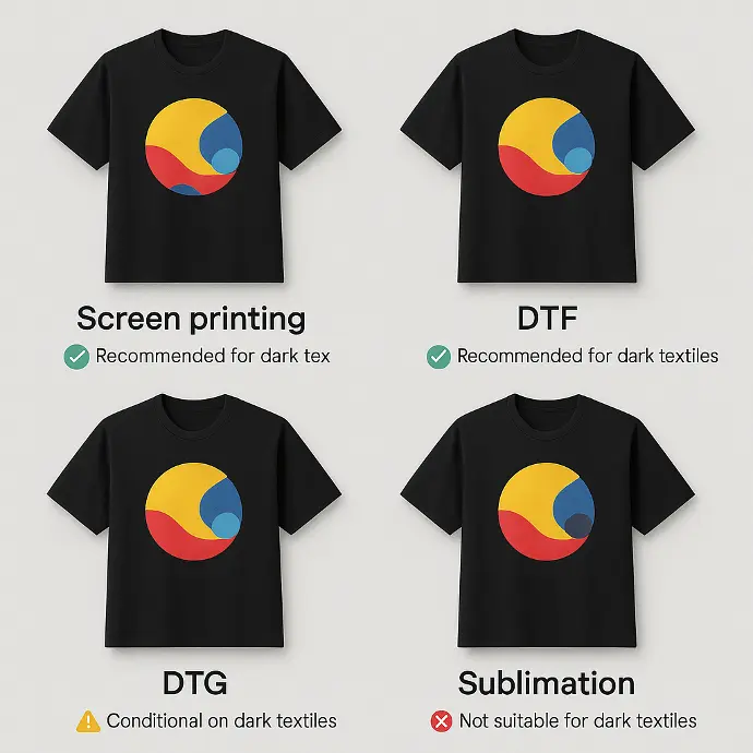
- La sérigraphie et le DTF sont les techniques les plus fiables.
- Le DTG fonctionne, mais reste délicat et technique.
- La sublimation ne convient pas du tout aux tissus foncés.
- Un test avant production est essentiel pour éviter les mauvaises surprises.
1. Spécificités techniques de l’impression sur textile foncé
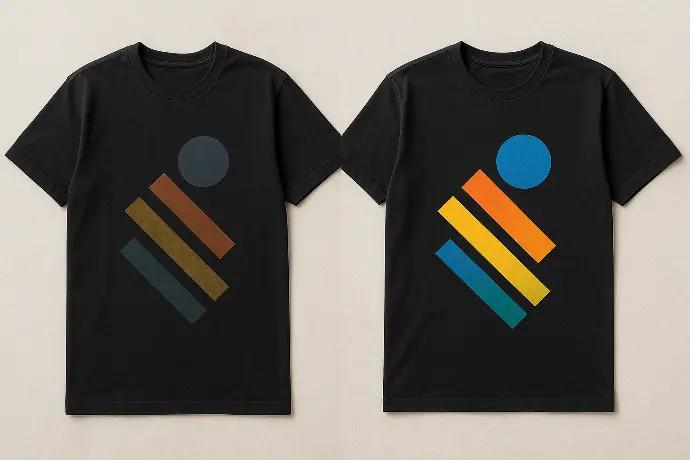
L’impression sur textile foncé peut offrir un résultat super qualitatif avec des couleurs vives si celle-ci est bien réalisée. Contrairement aux textiles blancs qui sont comme une toile parfaite pour accueillir les couleurs vives, les vêtements foncés ont tendance à ‘absorber’ les couleurs, pas littéralement, mais si celles-ci sont un peu transparentes alors elles peuvent se perdre sur un fond sombre.
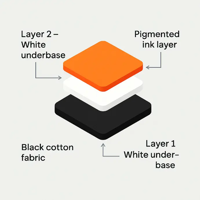
Alors, faut-il une sous-couche blanche pour imprimer sur un t-shirt noir?
Absolument! Une sous-couche de blanc est indispensable pour imprimer sur des vêtements foncés - on applique cette base qu’on appelle également pré-traitement. Cependant, il y a parfois des exceptions; en cas de techniques très spécifiques ou d’effet volontairement ton sur ton.
La fonction de cette sous-couche est claire: créer une séparation entre la couleur sombre du tissu et les encres aux couleurs vives, afin de garantir un résultat fidèle au logo souhaité. Sans ce pré-traitement, même les meilleures encres finiront par perdre de leur intensité et se mélangeront à la teinte du textile. Par exemple, dans le temps du jaune peut virer au kaki ou bien du rouge peut tirer vers le brun.
Une autre question qu’on pourrait se poser c’est “quelle encre utiliser pour imprimer sur des vêtements foncés?” et si la qualité de l’encre a une influence dans ce genre de cas. Et bien forcément, plus une encre est pigmentée et opaque, mieux elle pourra résister à la couleur du textile en dessous et rester visible sans tirer vers le ton sur ton.
Donc, il ne suffit pas d’une bonne sous-couche mais il faut également de bonnes encres bien épaisses et opaques pour s’assurer de la meilleure tenue dans le temps possible. Avec les encres fines, même si le résultat en sortie de production est parfait, les couleurs pourraient s’estomper et perdre en intensité avec les lavages.
Un autre problème qui peut survenir lors de l’impression de textiles foncés est l’écrasement des détails fins, rendant les logos et textes illisibles. La seule manière de contrer ce problème et de garantir un visuel net et fidèle est une bonne sous-couche blanche bien posée.
Certaines encres sont formulées spécifiquement pour le textile foncé (en sérigraphie ou en DTF). Chez INKOO, nous faisons le choix d’encres à base d’eau — plus respectueuses de l’environnement et du textile — ce qui demande une maîtrise particulière pour obtenir un bon rendu sur fonds foncés.
En sérigraphie, il existe des encres à base d’eau plus opaques, ce choix est un engagement de qualité et environnemental mais cela inclut plus de rigueur dans la préparation des fichiers et dans la technique utilisée.
En DTF, l’opacité dépend surtout de la qualité du film et du blanc d’accompagnement dans le fichier/impression — ce n’est pas l’encre seule qui fait le job.
Les textiles foncés exigent plus de rigueur : la couleur du tissu influence directement la lisibilité, l’intensité et la tenue des encres. D’où l’importance de la base blanche, d’encres bien pigmentées, et d’un bon choix de textile. On entre ici dans le cœur des techniques recommandées.
2. Les principales techniques d’impression textile et leurs limites
🎨 Sérigraphie (avec base blanche)
La sérigraphie est une technique qui fonctionnera toujours sur textiles foncés, mais l’application d’une base blanche est essentielle pour garantir un rendu fidèle à la demande initiale. Chez nous, on utilise que des encres à base d’eau, plus responsable mais qui nécéssitent une plus grande précision dans la préparation et l’application. Comme la sous-couche est blanche, le calage du cadre doit être le plus précis possible pour éviter un effet ‘encart’ autour du visuel. Mais ne vous inquiétez pas, chez Inkoo, on sait ce qu’on fait!
🔥 DTF (Direct To Film)
Le Direct To Film, c’est une technique qui inclut directement une couche de blanc dans le visuel, ce qui permet un très bon résultat sur quasiment toutes les matières. C’est une bonne solution pour des visuels compliqués ou multicolores pour garder une bonne intensité de couleur. Attention, le toucher du rendu final peut être légèrement plastifié selon le film utilisé mais globalement cela reste un très bon choix pour des séries intermédiaires ou variées.
🖨️ DTG (Direct To Garment)
Le Direct To Garment, pour rappel, est une technique qui imprime directement sur le textile avec un résultat très naturel. Mais bien sûr, sur textile foncé il nécessite un pré-traitement minutieux et une imprimante haut de gamme. Pour cette technique, il faut faire des tests au préalable car plusieurs facteurs peuvent impacter la production comme par exemple le type de tissu, l’humidité, etc. Adaptée aux petites séries, mais pas toujours aux textiles synthétiques, donc pas forcément la meilleure technique pour impression de vêtements foncés.
🧴 Sublimation
Malheureusement, la sublimation n’est vraiment pas une technique adaptée aux textiles foncés, je la mentionne ici pour vous mettre en garde car souvent considérée comme adéquate alors qu’elle ne fonctionne que sur polyester blanc ou très clair car l’encre est semi-transparente. Impossible à appliquer sur coton ou sur fond sombre car les couleurs disparaissent dans le tissu. La sublimation reste tout de même une bonne technique pour les objets rigides ou le sportswear clair.
3. Les pièges à éviter absolument
🔹 Logos ou visuels peu visibles
Si votre visuel est trop fin, aux contours précis ou dans des couleurs pâles il se peut que des erreurs de contraste apparaissent ou bien que les couleurs disparaissent simplement dans le textile. Ce sera d’autant plus fort sans sous-couche blanche ou si l’encre n’est pas assez opaque. Par exemple, un logo blanc cassé ou beige sur un t-shirt noir peut devenir complètement illisible de loin.
🔹 Tenue des couleurs médiocre
Si la qualité de l’encre ainsi que la sous-couche blanche ne sont pas au rendez-vous, il se peut que les couleurs se dissipent très vite au lavage. Avec comme résultat: des visuels fades et ternes, qui nuisient à la perception de la qualité du produit fini, ce qui peut s’avérer ennuyant dans un contexte pro ou de revente.
🔹 Effet collant, rigide ou “cartonné”
Une autre erreur qui arrive souvent c’est l’application excessive de l’’encre ou bien une mauvaise compatibilité entre le tissu et la technique d’impression.
Cela peut créer un visuel rigide au toucher, peu agréable à porter, et souvent disgracieux visuellement (relief épais, aspect plastifié). Ce soucis peut être accentué si la sous-couche est trop dense ou mal répartie.
4. Nos conseils pour un résultat professionnel
🎯 1. Bien choisir son encre
Pour imprimer correctement sur textiles foncés, le choix de l’encre est crucial, il faut privilégier les encres bien pigmentées et opaque, pensées spécifiquement pour résister à l’absorption visuelle du fond sombre. Nous recommandons toujours un test de compatibilité avec le tissu choisi car certaines encre réagissent différemment selon le type de textile (coton, polyester, etc).
⚪ 2. Ne jamais négliger la base blanche
Bon là je commence à me répéter, mais vous l’aurez compris: la base blanche est vraiment super importante pour une bonne réalisation d’une impression sur vêtement foncé. Que ce soit pour la sérigraphie comme la DTG jusqu’à la DTF (intégré directement dans le fichier), la sous-couche de blanc conditionne complètement le rendu et la tenue des couleurs. Son épaisseur est cruciale: trop fine -> le visuel sera terni; trop épaisse -> potentiel effet ‘carton’ désagréable à porter.
👕 3. Choisir le bon support textile
La qualité et la matière sélectionnées sont également assez importantes, on vous conseille d’éviter les textiles trop fins ou trop rêches qui absorbent mal ou peuvent déformer le visuel désiré. Les tissus synthétiques bas de gamme réagissent parfois mal à la chaleur (DTF) ce qui peut entraîner des défauts ou une mauvaise tenue dans le temps.
🧪 4. Toujours tester avant la production complète
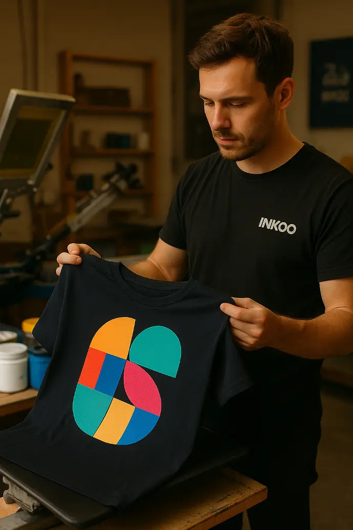
Chez Inkoo, avant de lancer une production, nous réalisons obligatoirement un test pour nous assurer que le rendu final sera au plus proche du visuel souhaité par nos clients. Cela nous permet de valider les couleurs, la compatibilité encre -tissu, ainsi que le toucher final. En réalisant ces tests et en faisant valider par nos clients, on évite des commandes entières refusées ou ratées.
Mini conclusion
Imprimer sur textile foncé, c’est tout un art — mais avec les bonnes techniques, un peu de rigueur et un œil expert, le résultat peut être spectaculaire.
Chez INKOO, on le sait bien : chaque détail compte. Alors autant les maîtriser pour transformer les contraintes en rendu pro (et wow).